
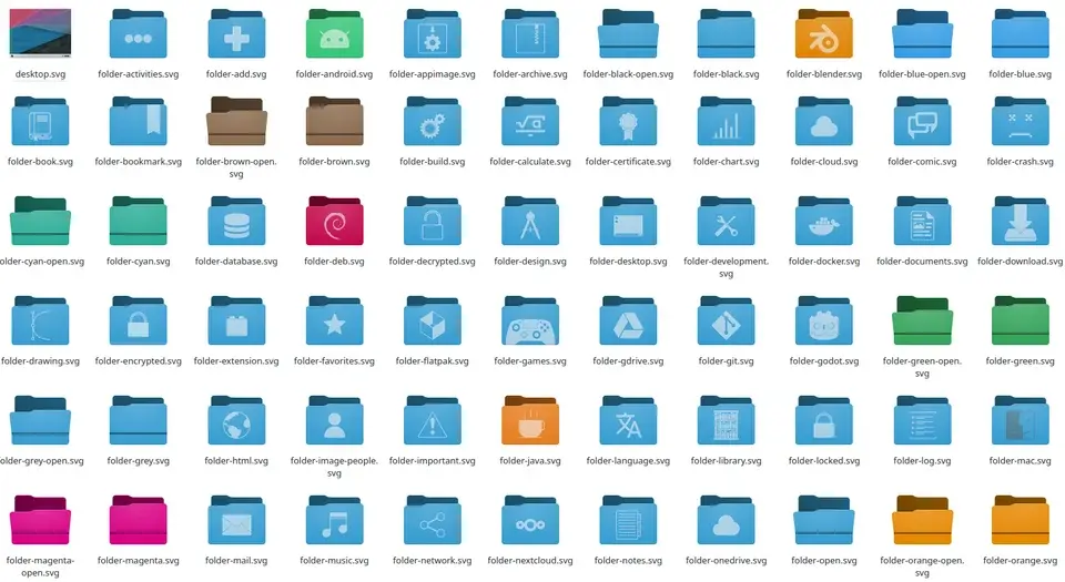
They look like a mix of Oxygen and Breeze. And look absolutely beautiful!
Much better than the current Breeze icons which look overly simple and flat.
This is the type of visual overhaul I was talking about.
These icons coupled with a great default wallpaper will make Plasma 6 look awesome!
Thanks to the great work from Ken Vermette who initially created the new icon set, and Niccolò Venerandi, who took over and improved it!
I quite like the look! Though, I know that design is subjective to people, so hopefully the old version is still available to choose.